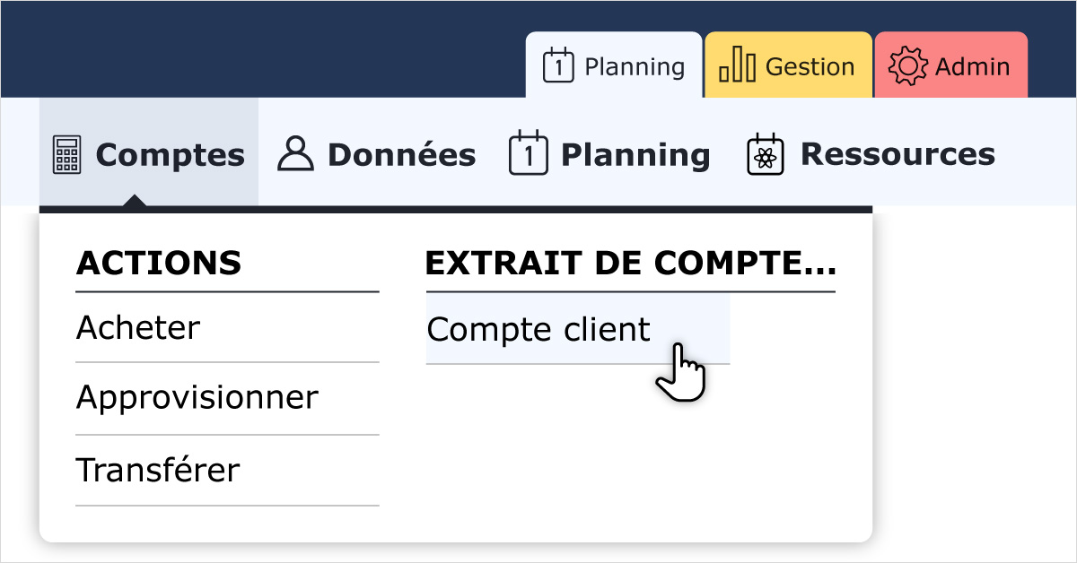
ReservationAutoEcole.com is regularly enriched with new features. The navigation menu intensifies in order to access these new pages. Its design, dating back several years, no longer allowed quick access to the many pages making up the platforms. This is why we have completely redesigned the menu. This provides clearer and more ergonomic navigation.

1 / A MENU STRUCTURED IN THREE TABS
The new menu is broken down into three tabs, each distinct by its own color.
Planning
- Users who only need to make reservations and activities.
- The main functionality of these pages is the schedule. The connected user also finds tools allowing him to manage his own data: activity capture, access to his accounts, modification of his information.
Management
- Users in charge of the daily management of a structure.
- These are mainly tasks related to accounting, such as: validation of activities, visualization of flows, making purchases and sales. Other features such as sending emails, user management, maintenance monitoring, as well as numerous monitoring reports are also available.
Admin
- Users with access to the platform configuration.
- The administration allows you to configure all of the functionalities available in particular in the other two tabs. It defines for example: types of activities and resources, user rights, billing rules. In addition, this is where the configuration of the structure is carried out.
2 / OTHER NAVIGATION RULES
Only one level of submenus is now displayed. This allows faster viewing of the contents of each menu. These are displayed via a panel which is displayed on hover under the relevant menu. The submenus are sometimes classified in the form of columns, when this clarifies their organization.
The menus and submenus are arranged in alphabetical order. This universal method does not favor a ranking that would seem obvious to some users but not to others.
The contents of the tabs and menus are accessible according to the rights assigned to each user, just like in the old menu.
Reports were previously collected in the Admin › Reports menu. The reports specific to certain functionalities are now associated with it in the relevant menu. For example, activity reports can be accessed via the Management › Activities › Reports column.
The new menu has adaptive ergonomics. On medium screen and small screen (tablet and smartphone), it is hidden by default. It is displayed by clicking on a button located on the left under the top bar.
3 / MAIN CHANGES
User accounts are now accessible in Management › Accounts › Accounts › Users (4th column in the Accounts menu).
The detail of the user accounts is also accessible from the list of users (Management › Users › Users › Active) by clicking on the account balance of the user concerned.
Documentation:
https://openflyers.com/fr/doc/of4/Menu-de-navigation